Thursday, February 28, 2008

Interactive baseball the Japanese way

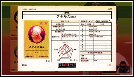
As it usually happens when I post about Japanese websites, I have no idea of the reason why they did it, I guess just for self-promotion, considering that the only brand name on the site is the one of the agency (Bascule, the same that did Axe Busters some time ago).

japanese_baseball01.jpg

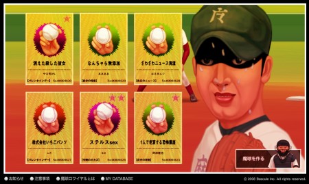
Is it an advergame? Probably... For sure it's a weird visual experience about baseball, with a good art direction and remarkable usability, a characteristic that makes it quite easy to find the way around and play.

japanese_baseball02.jpg

Adobe's cards without a soul

Adobe is online with a new, impressive website, launched to promote its Creative Suite 3. Everything starts with a card. Move the scroll bar at the bottom to unveil a world of amazing animations created by Goodby, Silverstein & Partners and Mike Kellog.

adobe_cards01.jpg

You can tell they really wanted to impress designers. Copy is practically non-existent...

adobe_cards02.jpg

You know I'm the devil's advocate, but to be sincere I would have l enjoyed a bit of text and, in general some information to put the story in context. As it is now, I feel the experience is great but incomplete. I understand I'm not the target for this product (probably designers are more for a "show, don't tell" approach) but still, I think they could have done something more than a lovely animation exercise.

adobe_cards03.jpg

What do you think?

via Cpluv.